
Trend Watch Tuesday: Large Scale Florals (or hello Maximalism)
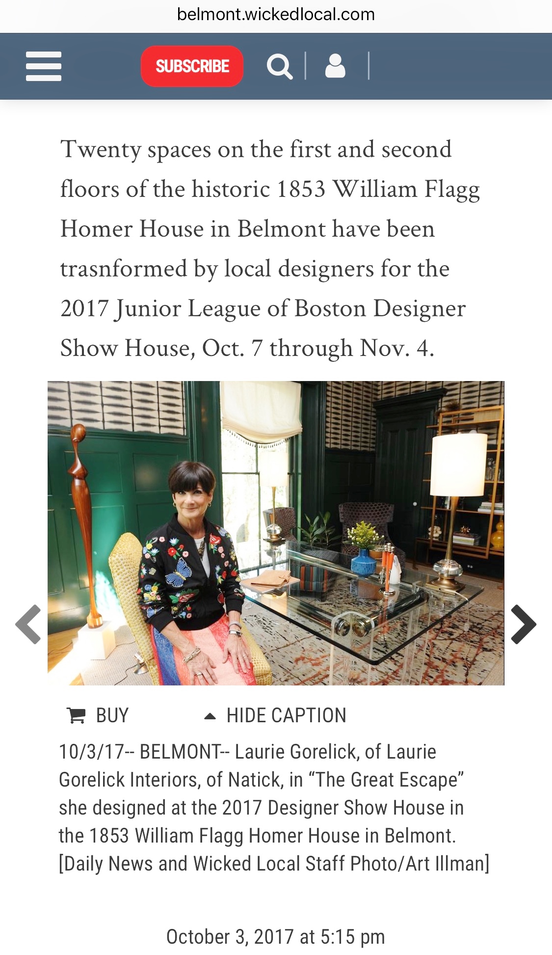
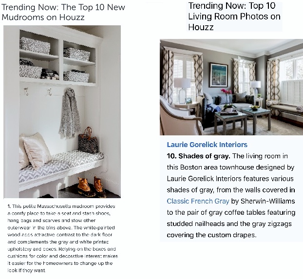
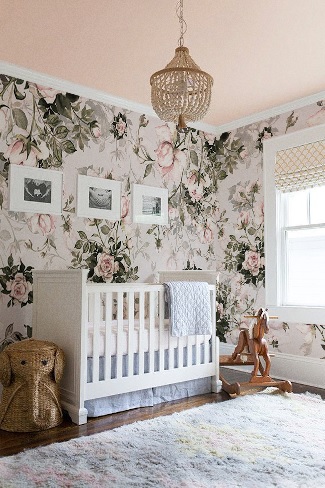
 Laurie Gorelick Interiors
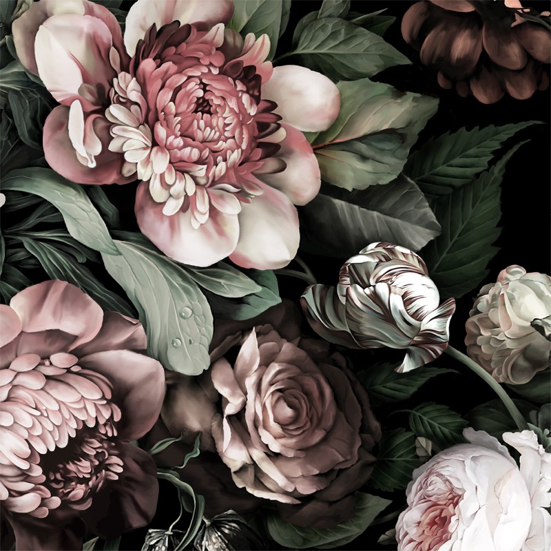
 I knew when I saw it. On a trip to Los Angeles in March 2016, I saw a large scale graphic wallpaper in a tonal palette with touches of pink. I knew it was going to be big (and not just in the literal sense!).
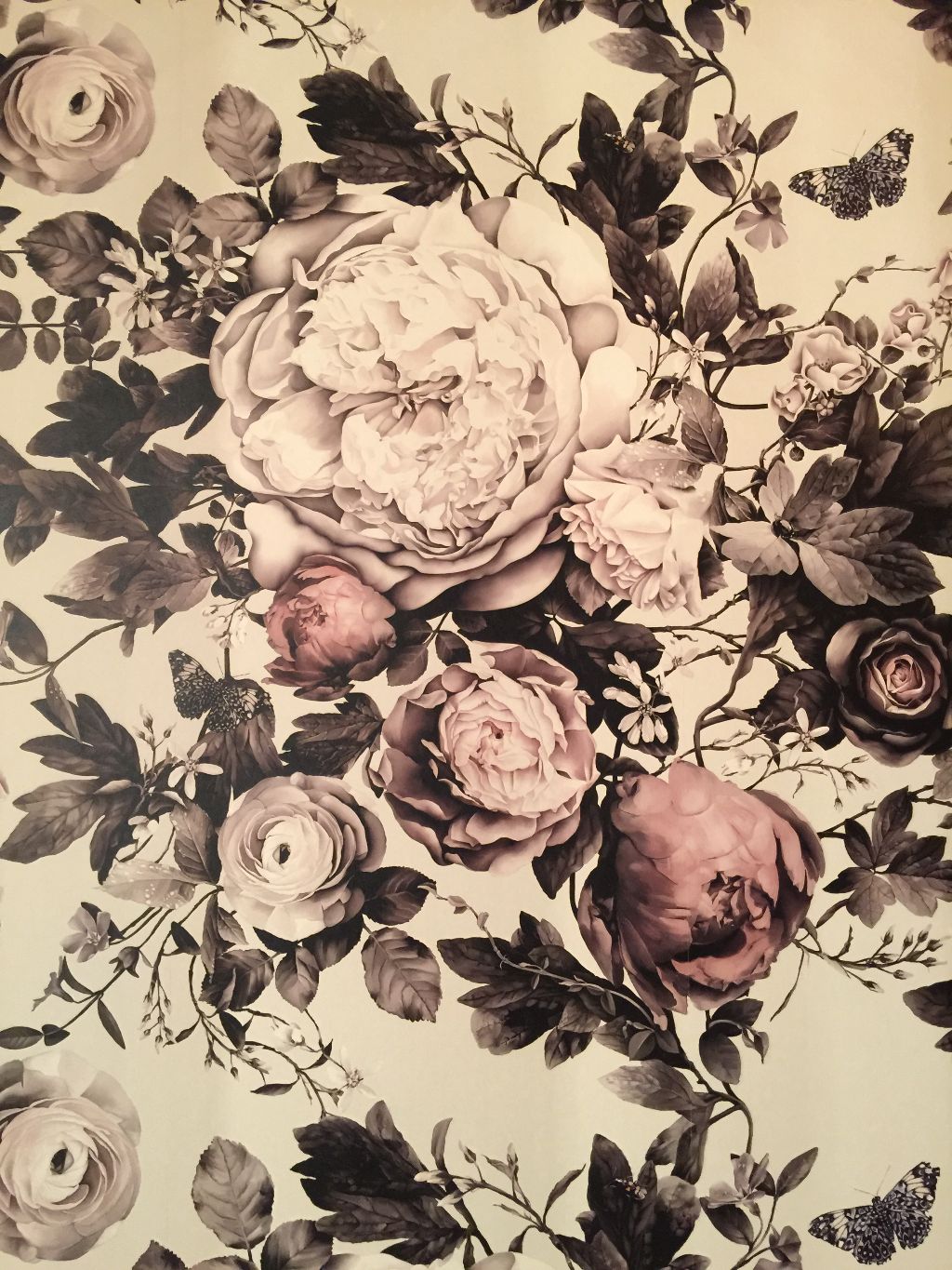
I didn't know the source of the wallpaper at the time, but soon after, I came across the collection of Ellie Cashman and knew I had struck gold. Ellie is an American living in the Netherlands. Inspired by the still life painters of the Dutch Golden Age (among them Rembrandt and Vermeer whose paintings reveal a fascination with light and an attention to detail), she created her now famous Dark Floral wallpapers.
Ellie may have set in motion more than a hot wallpaper design. The tendency to "go big or go home" in design is being referred to as "maximalism." It's goodbye to "hygge" -- the 2016-17 buzzword for pared-down simplicity and Scandinavian homeyness. Think of maximalism as a bygone English manor house with books towering floor-to-ceiling, ancestral portraits covering every square inch of wall space and mismatched antique Persian carpets layered over bare floors. Now think of the 2018 version of that image. Going to the extreme -- in color, pattern, scale, style -- is maximalism. Anything but boring. Large scale florals are just one way to go maximalist.
The trend is showing up on everything from fashion to home furnishings. Dolce & Gabbana exhibited large scale florals in their Spring 2018 ready-to-wear collection.
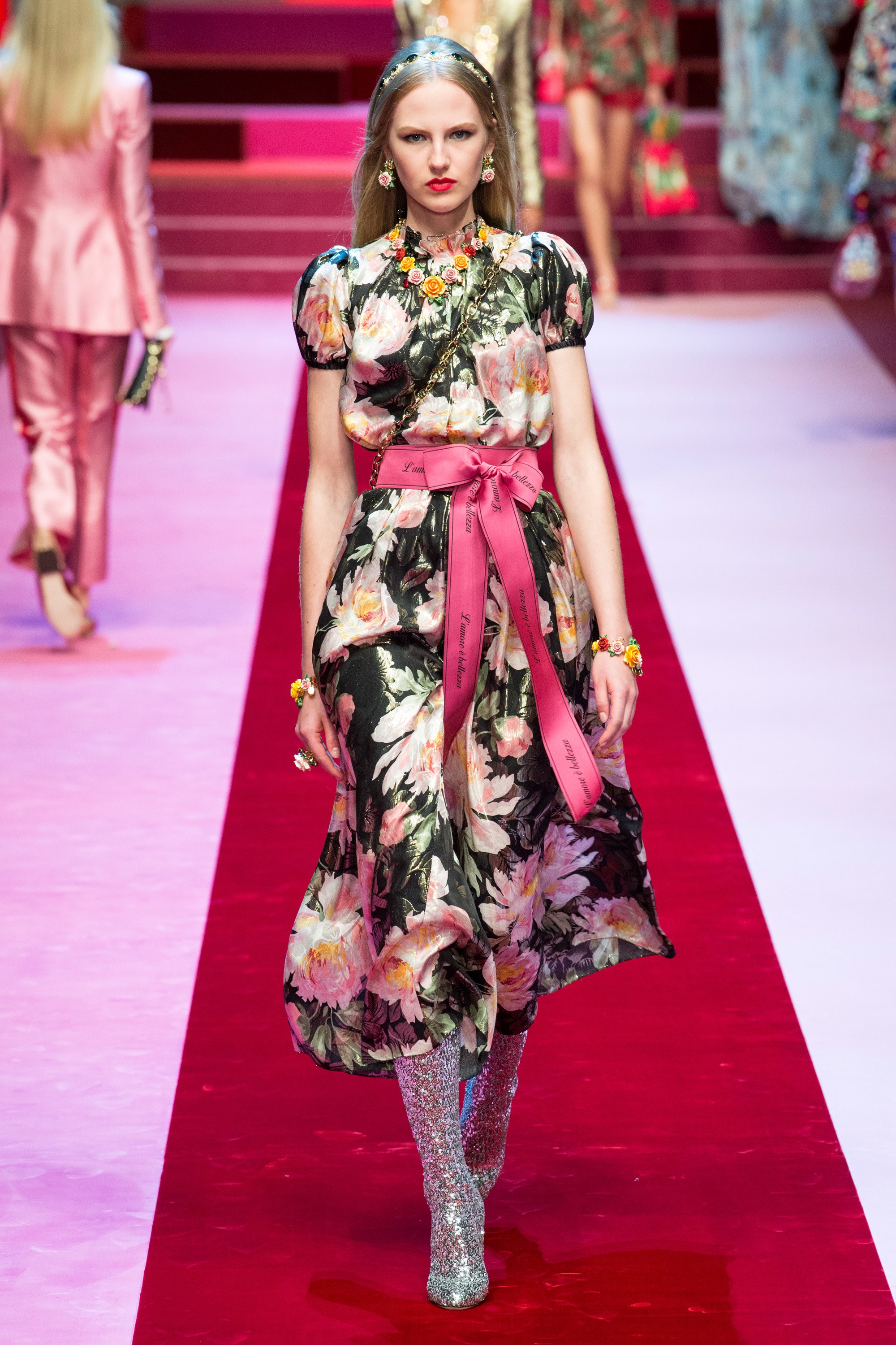
Photo by Yannis Vlamos courtesy of Vogue
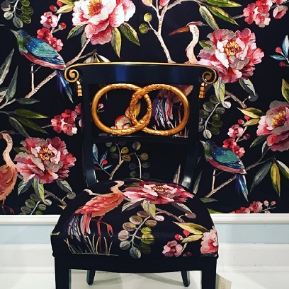
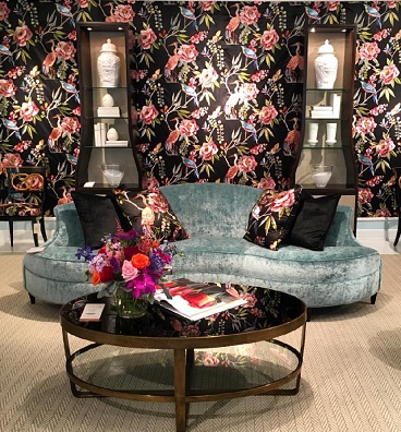
Large Scale florals were evident at High Point Market last fall. Editors of Traditional Home magazine noticed these florals on upholstery as well as walls.
Designer Robin Baron custom designed a large scale floral for a room at the 2017 Holiday House in New York City.
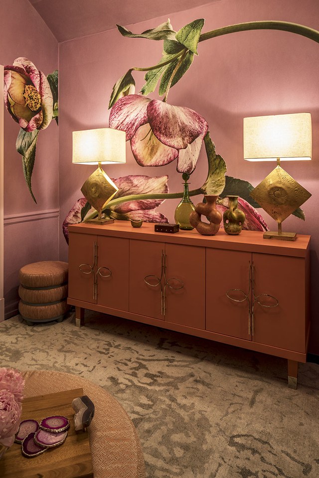
Photo courtesy of Architectural Digest
Using large scale floral patterns in the home doesn't have to be a long-term commitment. Coloray makes wallpaper in large scale floral patterns that is removable.
Stay tuned to the blog for more 2018 design trends.