Sunday
Jun042017

What Price Wellness?

Last Thursday (June 1, 2017), I listened to Donald Trump announce that the United States would withdraw from the Paris Agreement to combat climate change.  I'm trying to keep this blog a politics-free zone . . . so I won't say anything more about that here.  I mention it to bring up the environmental challenges we all face, even in our own homes.  What price would you be willing to pay to ensure that your own home environment didn't make you sick, but rather promoted wellness?

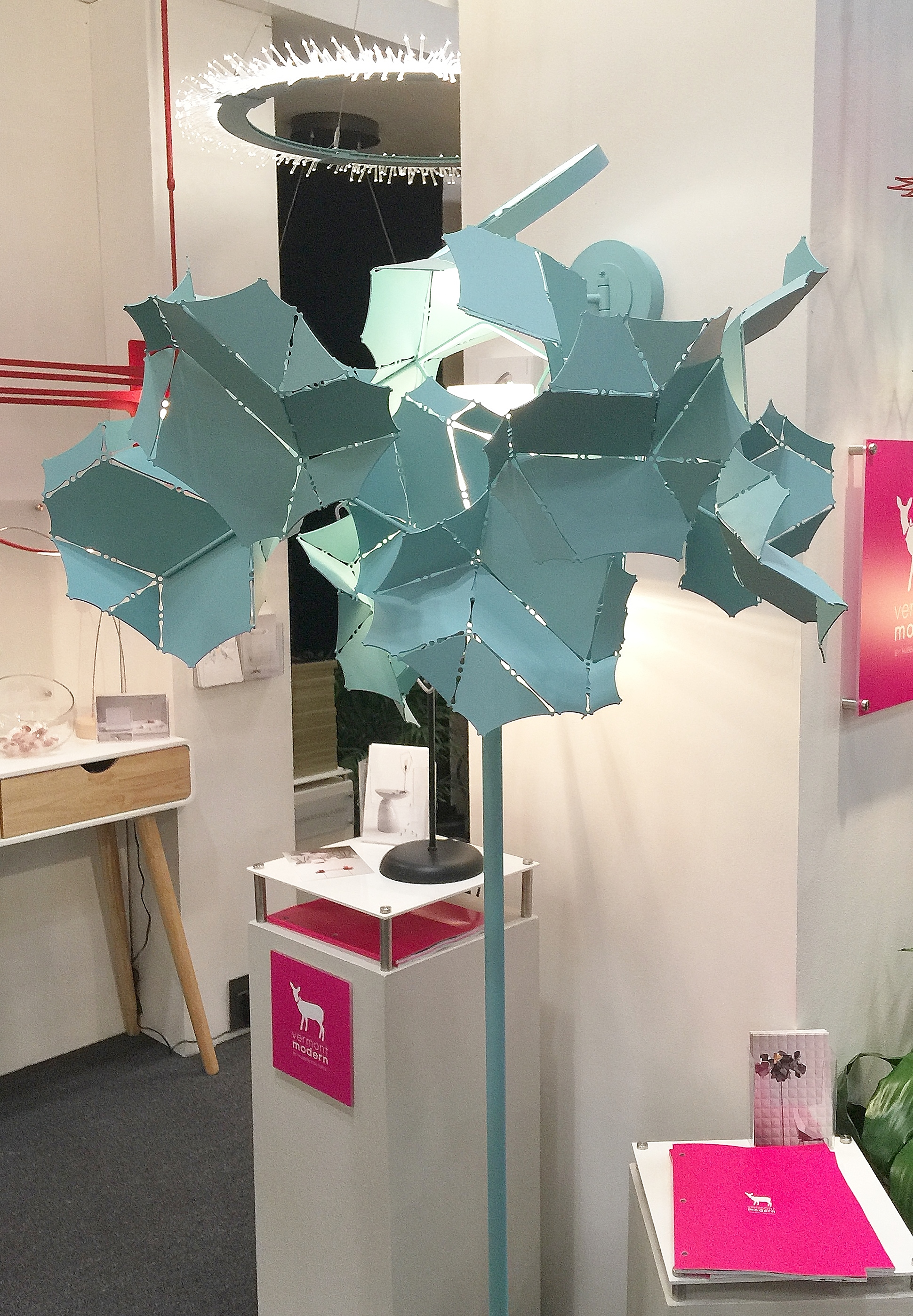
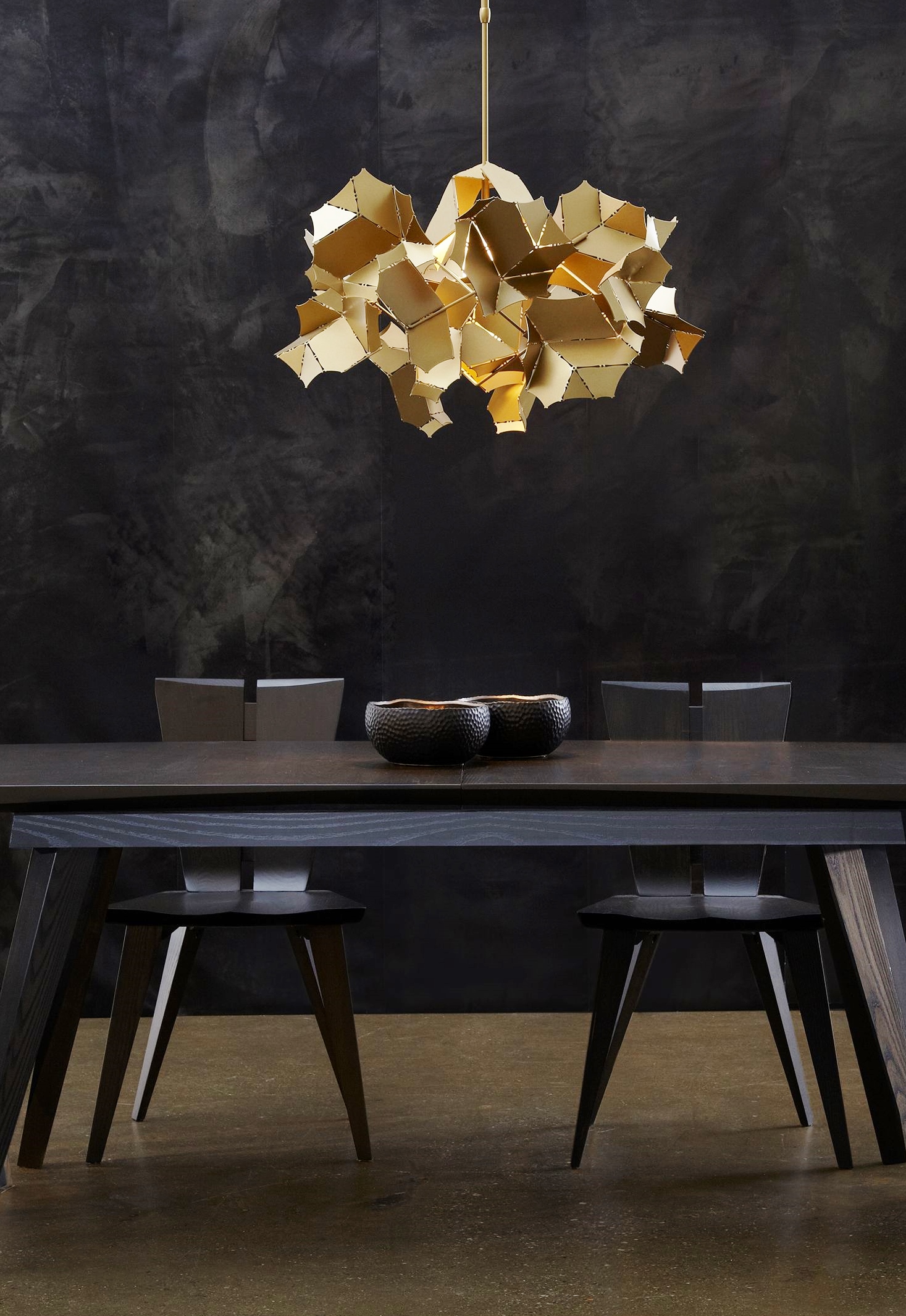
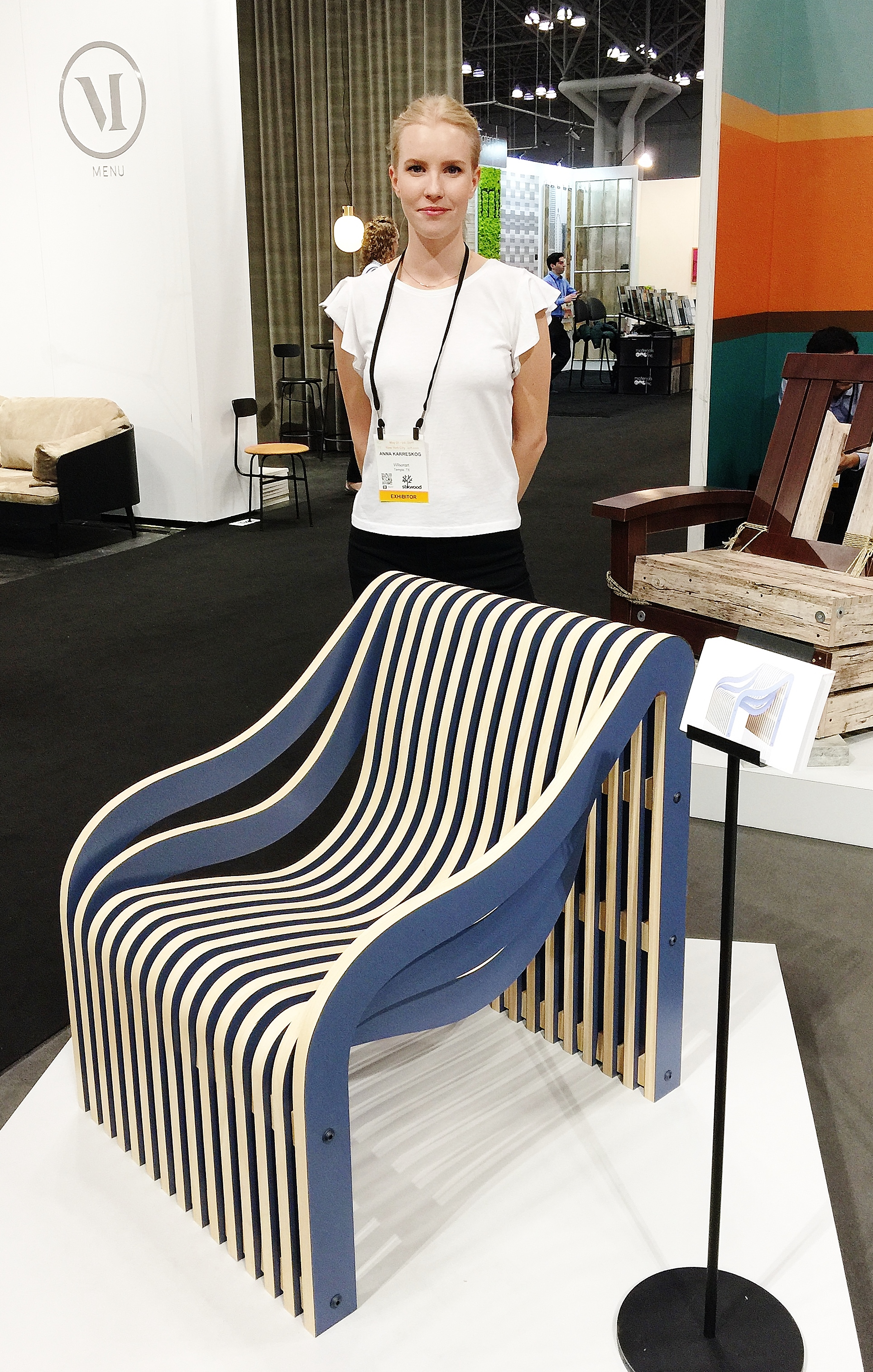
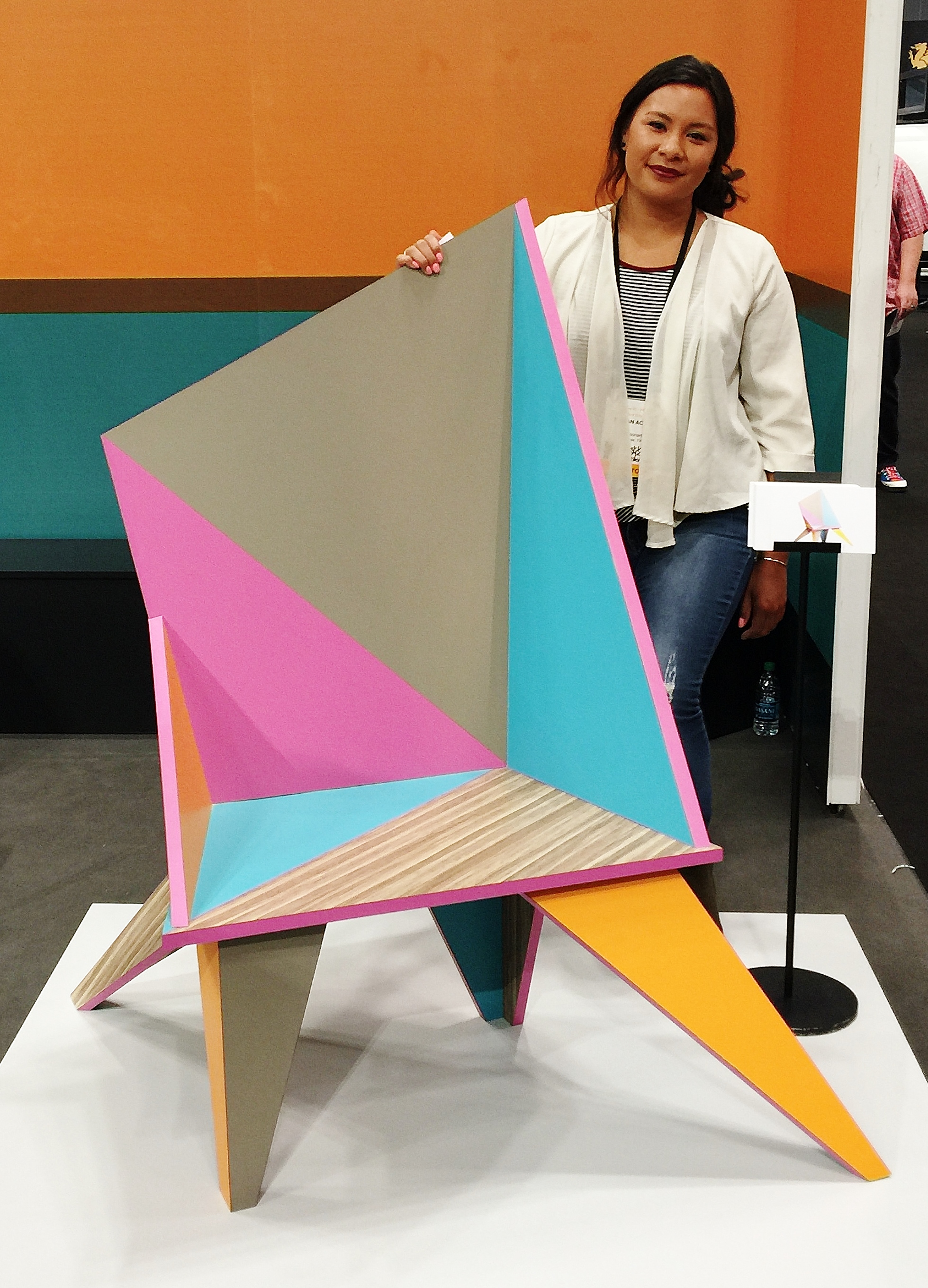
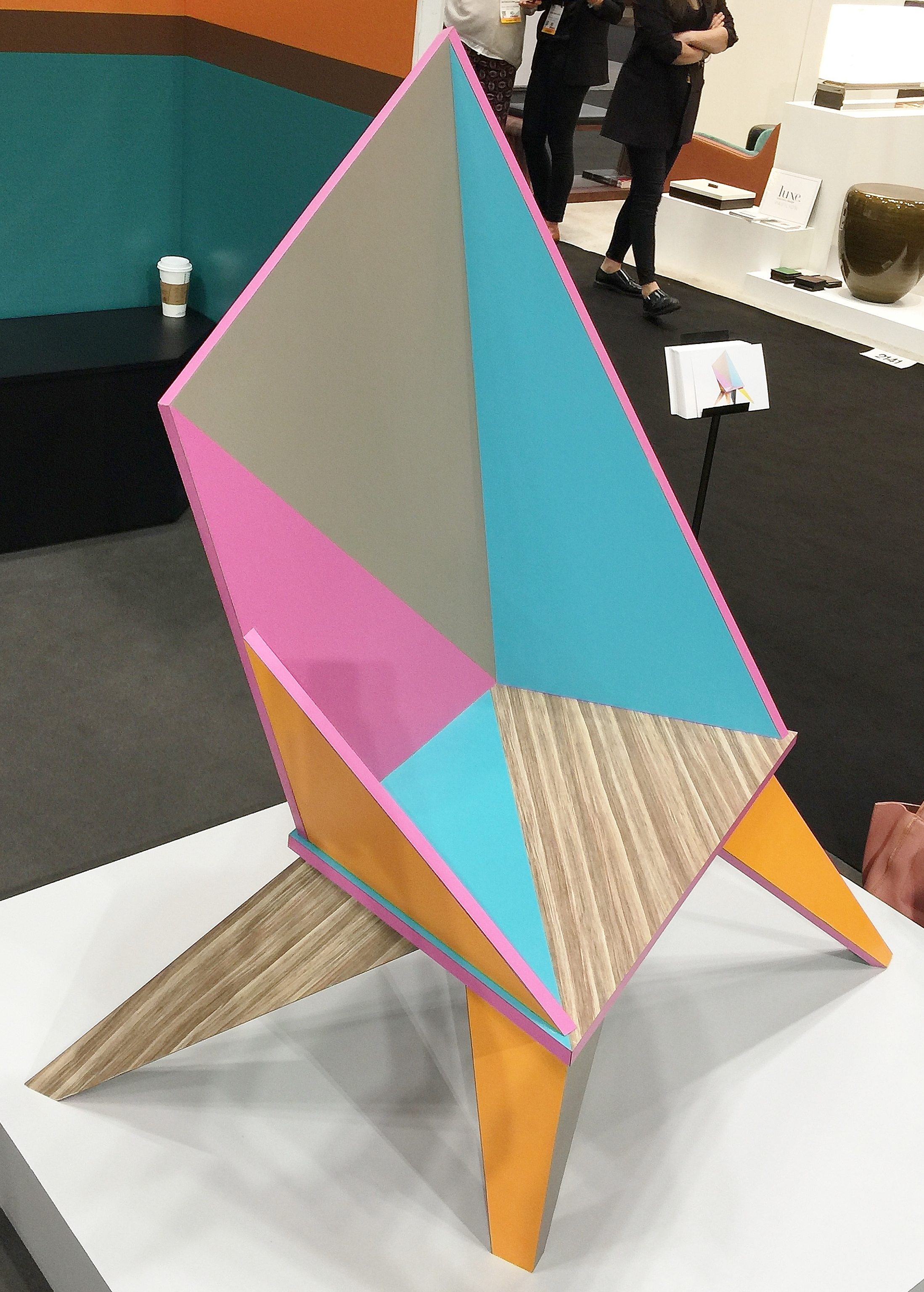
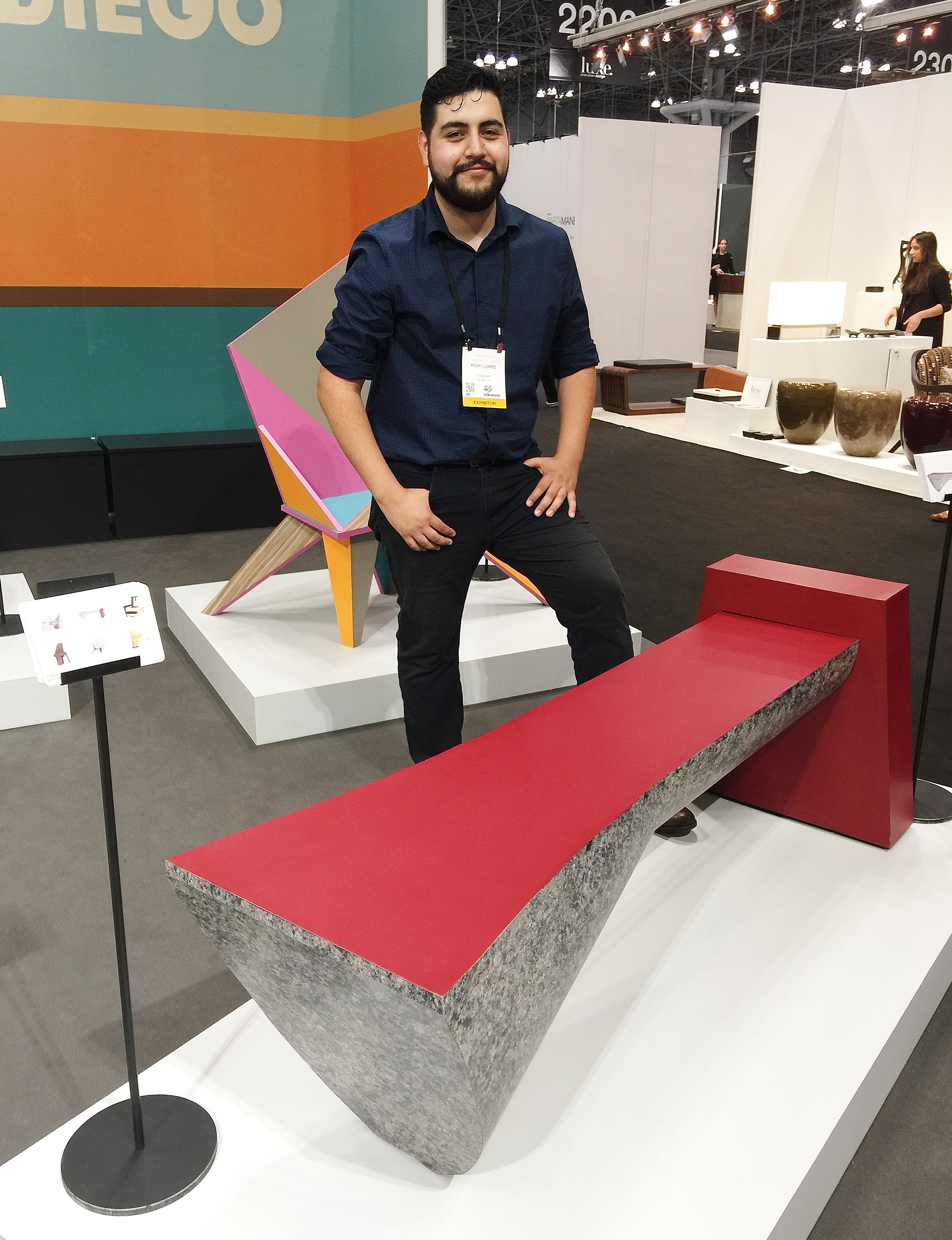
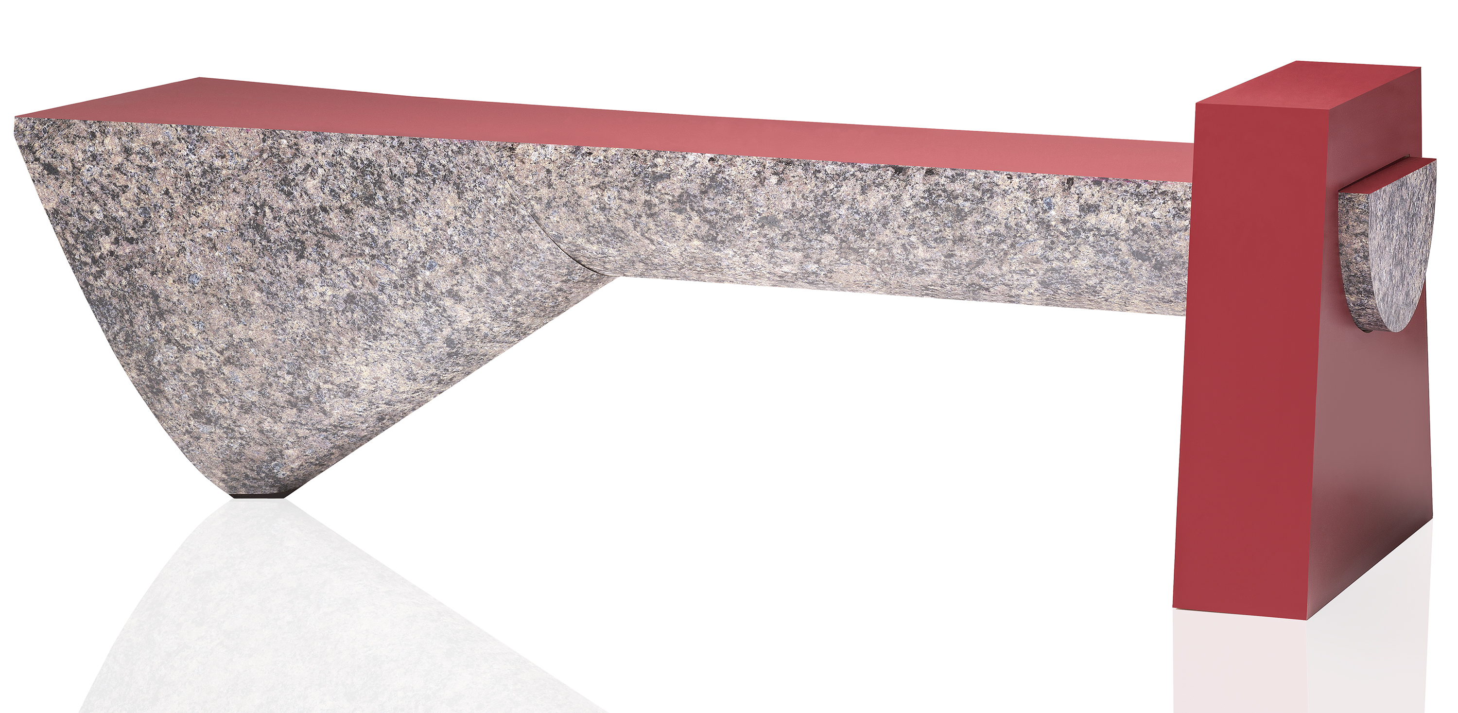
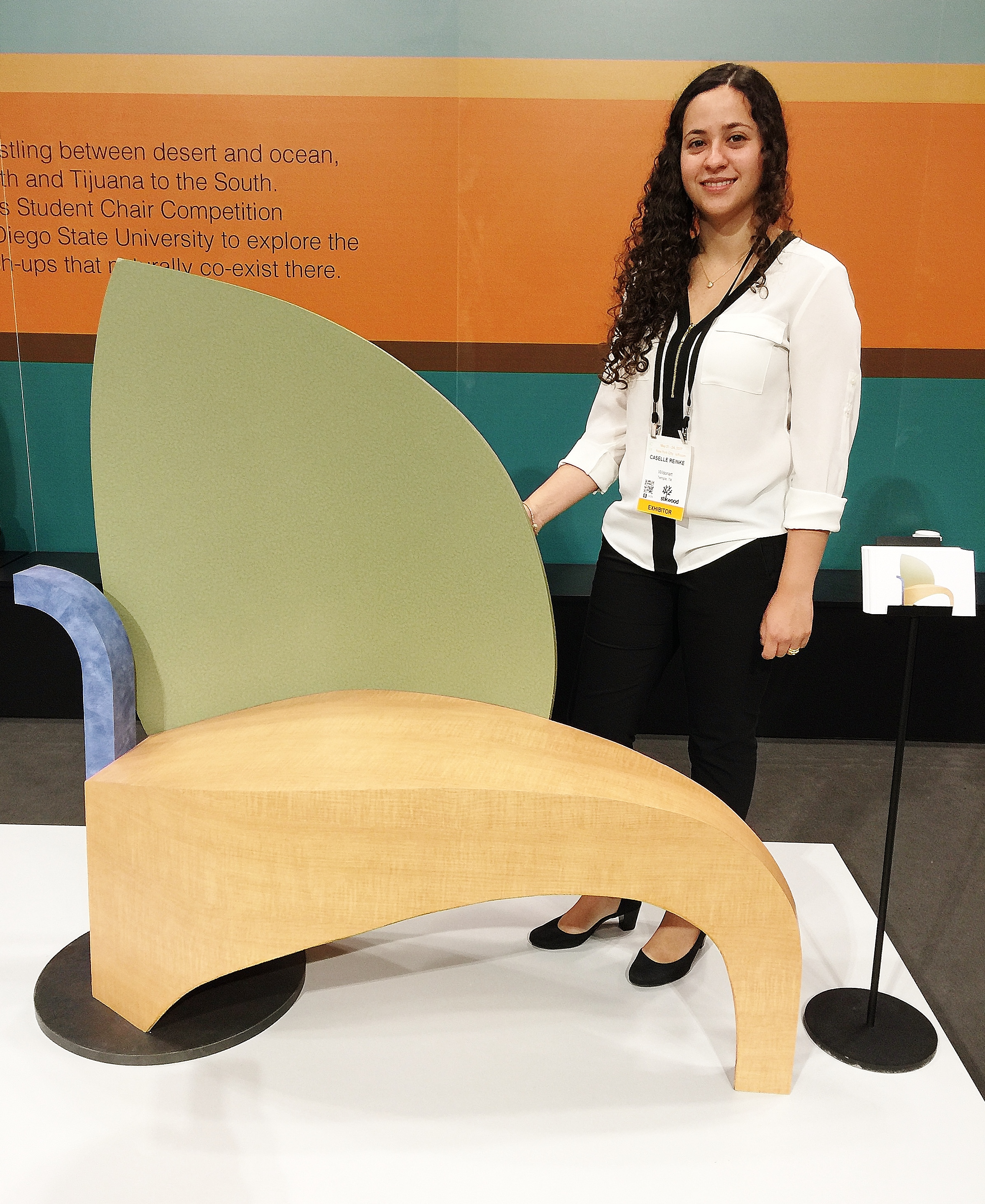
I was part of a group of designers, design bloggers and wellness professionals who, as #DesignHounds, entertained this question two weeks ago in conjunction with the International Contemporary Furniture Fair (ICFF) in New York City.  What if it's not your diet, or your sedentary lifestyle, or stress that is making you sick, but your furniture?  Seriously, that's not a ridiculous question.

In modern times, we faced the major realization that our interior environments could make us sick when Legionnaire's Disease broke out at an American Legion convention at a Philadelphia hotel in 1976.  The culprit was a bacterium naturally found in fresh water, but which can become a contaminant when found in man-made water systems.  This outbreak made us acutely aware of how vulnerable we are not only to external air quality but to interior air quality as well.

In addition to air quality, these aspects of our interior environments impact our well being:

  • exposure to light
  • water quality
  • sleep quality
  • ergonomics and comfort
  • acoustics and noise disruption

It seems a no-brainer that if you could incorporate furnishings and materials in your home that could enhance your health and vitality, you would, right?  But most people don't.  Simply because they cost more.

You can improve your interior environment (and, in turn, the exterior environment) with some simple fixes:

  1. Use a zero-VOC (Volatile Organic Compound) wall paint that absorbs and reduces VOCs.  Sherwin Williams Harmony latex paint is one example.  Not only does it reduce VOCs, but it prevents build-up of mold and mildew.
  2. Avoid buying furniture and cabinets made with conventional particleboard, plywood and medium density fiberboard (MDF) which may contain formaldehyde-based adhesives.  Choose furnishings made with certified-sustainable hardwoods or formaldehyde-free particleboard, plywood and MDF.
  3. Avoid synthetic carpets and rugs, synthetic padding and glue-down installations.  Choose wool or other natural fibers for carpet.
  4. Avoid furniture and mattresses made with foam.  Foam produces harmful VOCs.
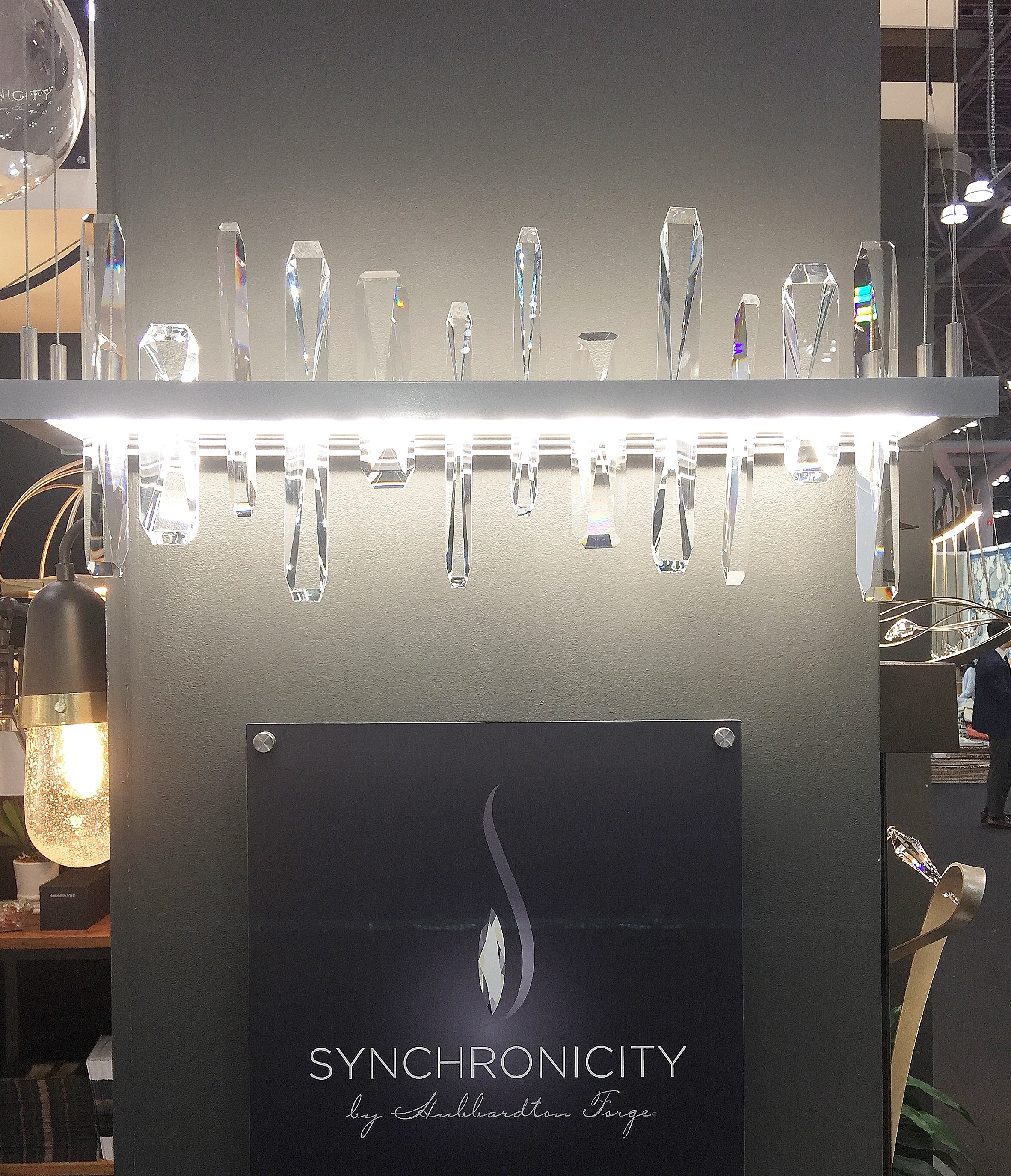
  5. Incorporate dynamic lighting systems.  Dynamic lighting provides the appropriate light levels for the specific environment and its intended uses.  It also matches light levels to our natural circadian rhythms, for example, by dimming lights as daylight wanes and sleep approaches.
  6. Reduce ambient noise by installing sound-absorbing materials (rugs and carpet, draperies, even bookshelves with books) and insulation.  Update appliances with newer energy-efficient models that make less noise.  Install double-pane windows and storm windows.  Replace hollow-core doors with solid wood doors.
  7. For ergonomics, avoid furniture that causes slouching and poor posture.  A good tip -- measure the distance from the small of your back to the inside of your knee.  Chairs and sofas that have a seat depth greater than that measurement will lead to slouching and cause back and neck strain.

Now, consider adding features that promote wellness.  It's long been considered a feature of luxury bathrooms to incorporate a steam shower.  It's not just for the in-home spa experience.  It's for good health.  A steam shower promotes respiratory health, improves our appearance by hydrating the skin, removes body toxins, increases circulation, reduces stress and encourages relaxation, boosts metabolism, and increases flexibility, among other health benefits.  Adding aromatherapy, chromatherapy and music to a steam shower augments the health benefits.  If you amortize the cost of a steam shower over the time you'll live in your home, it could cost just a few dollars a day . . . less than the cost of your daily coffee habit.  Wouldn't that be worth the price for your health and well being?

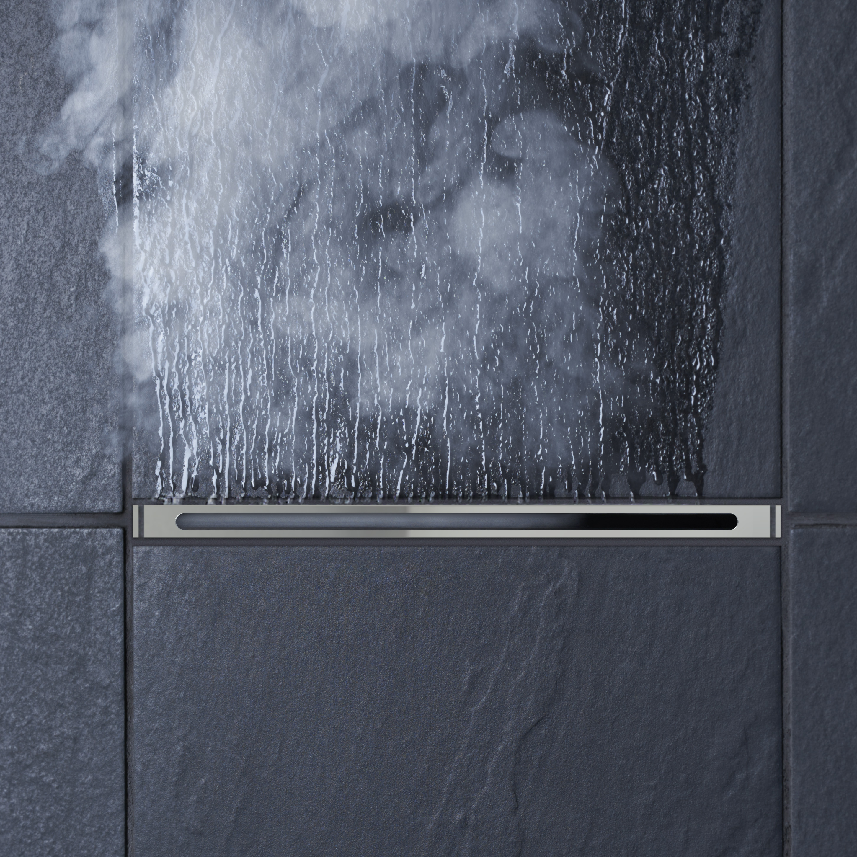
I've written before about Mr.Steam, an industrial leader in the manufacture of steam boilers and in the promotion of health and wellness through steam showers.  Since my previous post about Mr.Steam, the company has added some attractive features to its product line that enhance the health and wellness benefits of its products.  It has introduced a Linear SteamHead (left) that lies flush to the shower wall, is quieter and reduces the pooling of condensate.  Mr. Steam has added aromatherapy to the steam shower experience with AromaSteam SteamHeads.  Chromatherapy is available with Mr.Steam's ChromaSteam system which introduces a spectrum of colors through waterproof LED modules for the steam shower.  And, to ensure that your experience lasts even after you step out of the shower, Mr.Steam has introduced a line of attractive towel warmers.

If health and wellness is important to you, wouldn't it be worth making your home a place that supports that aim?

Friday
Jun022017

Not Your Parents' Hubbardton Forge

If you're familiar with Hubbardton Forge lighting, what images come to mind?  My first taste of the company's products was 20 years ago before I was a designer when I was selecting a pendant for my kitchen.  I was attracted to the simple lines of their forged iron fixtures inspired by nature and arts and crafts style. 

That is not today's Hubbardton Forge.

In January 2017, Hubbardton Forge introduced two new lines that bring the company into new product territory: the Synchronicity line and Vermont Modern.  I saw fixtures from both lines with the #DesignHounds at the 2017 International Contemporary Furniture Fair (ICFF) and they were clear and welcome departures from what I've come to expect from the Hubbardton Forge brand.

For designing Synchronicity, Hubbardton Forge assembled craftspeople with backgrounds in architecture, jewelry making, stone carving and artisan glass.  Uniting Swarovski crystals with LED technology, the outcomes are dramatic and utterly contemporary.


The Solitude fixture (above) features angular crystals emanating from an LED light guide.  The crystals and LED light source scatter light brilliantly, casting a glamorous sparkle.

Hubbardton Forge has partnered with Swarovski to introduce Swarovski's Wave Cut crystal, a crystal that has both concave and convex surfaces.


Close-up of the Swarovski Strass Wave Cut Crystal, left, and the crystal in the Synchronicity Courbe Duet Pendant, right.  Photos courtesy of Hubbardton Forge.

The sinuous steel forms of the Courbe Duet Pendant (above) match the graceful arch of the Wave Cut crystals.  Hidden LED light sources make this fixture less about illumination and more about art.

Artisanship is evident in the Synchronicity Solstice Pendant, below.  Each of the textured glass pieces is handmade.

As graceful compositions of glass and steel, the Synchronicity fixtures lend themselves to more luxurious settings.  In contrast, Vermont Modern fixtures are more edgy and geometrical, catering to a more modern and industrial vibe.  Available in six standard colors -- black, white, gold, silver, red and aqua -- on powder-coated steel, Vermont Modern's fixtures are perfect for adding a whimsical touch to not-so-serious interiors.

The Vermont Modern Anemone LED Pendant features bristles in a steel frame and comes in  circular and linear forms.

At ICFF, Vermont Modern displayed an aqua floor-lamp version of their Cumulus fixture.  It's a fun sculptural piece that floats on its base and has mobile-like qualities when ever-so-slightly pushed.

When I saw the fixture as a gold pendant in the Vermont Modern catalog, I saw its potential in a variety of settings.

As my experience at ICFF shows, it's time to take a fresh look at Hubbardton Forge and its sister lines. 

Wednesday
May312017

ICFF 2017 -- Wilsonart Challenges Student Chair Design Competition

Last week, I took a break from my workaday routine to attend with the DesignHounds one of my favorite design trade shows, the International Contemporary Furniture Fair (ICFF) in New York City.  A highlight of the show, and a privilege I've had for two years running, is interviewing the winner and runners-up in the Wilsonart Challenges Student Chair Design CompetitionWilsonart, an international leader in engineered surfacing materials ranging from high-pressure laminate to quartz, has sponsored this competition for over twelve years.  Partnering with a different design school each year, Wilsonart provides students with a year-long classroom experience in which they tackle furniture design and construction and learn to prepare for a trade show.  It's particularly appropriate that the winner and runners-up get to show their creations at ICFF which typically attracts independent artisans and trend-setters at the forefront of contemporary design.

Each year, Wilsonart creates a specific challenge or theme which the students must execute with Wilsonart laminate.  This year's theme was "borders, boundaries and mash-up," inspiring the students to explore the extremes posed by their environment, culture and society.  Wilsonart partnered with San Diego State University for this 13th annual competition.  Given the multicultural influences in San Diego and the topographical disparities, San Diego State was an excellent school choice, and the students rose to the challenge.

The winning design was titled “A Piece of Tlaltecuhtli” by Matthew John Bacher.  Matthew was inspired by The Tlaltecuhtli Monolith (shown left), a giant historical relief he had viewed at the Museo del Templo Mayor in Mexico City.  Matthew's chair symbolizes the appropriation and commercialization of cultural artifacts.  To Matthew, San Diego is an epicenter for the "borders, boundaries and mash-up" theme as a tourist destination where Hispanic culture is reduced to iconography and merchantable souvenirs.  The judges also found his choice of materials --a laminate that mimics real stone -- an apt expression of the theme.  Also symbolizing misappropriation is the support Matthew used to prop his design: constructed of MDF and painted white, the support cheapens the artistry of his chair.


The winning chair, front and reverse, and its designer, .

Drawing inspiration from the Pacific Ocean at San Diego's doorstep, Anna Karreskog, a visiting student from Sweden, created her chair entitled "Waves."


Anna used blue and wood-toned laminates to represent the colors of sand and sea.  The shape of each spline is emblematic of the crest and trough of a single wave.  Taken together, the splines represent a series of waves and architecturally symbolize positive and negative space.  I found Anna's design culturally significant in a different way than others: its form and construction seemed rooted in the Scandinavian esthetic of her native Sweden.

The chair created by Megan Acera, titled "Joyful Frustration," combined the geometric forms created by acute angles with playful colors to symbolize the range of emotions inherent in the creative process.


I interpreted the convergence of the angles and lines of the wood grain to represent the successful result the designer achieves after much trial and tribulation.

Ricky Lopez, a native of San Diego, designed a bench that symbolizes the reliance of the manmade on the natural world.


The form is an Ionic column, halved and on its side.  Support of the column is dependent on the mortised block.

Caselle Reinke was inspired by the San Diego landscape in designing her chair, "Origins."


The colors and organic forms represent the mountains to the east, the ocean to the west and the palms and other vegetation that dot the landscape.

"Home Less Home," created by Chuck Thompson, explores the extreme contrast between San Diego's inhabitants: its luxury homeowners and its homeless population, the fourth largest in the United States.


Its a "mash-up" of forms: a glossy walnut-looking laminate covering remnants of a Morris chair; a raw wood-looking laminate mimicking deconstructed crates; and a concrete-looking laminate base.  The designer intended the chair to illustrate both the contrasting demographics of the San Diego populace and the precariousness of financial security: how an unforeseen event such as illness or unemployment can create a path to homelessness.  The concrete-looking support props up the chair, demonstrating that available assistance can keep someone from "hitting rock-bottom."

Tuesday
Mar282017

Planning an Exit Strategy

I've been away from the blog far too long.  But life has gotten in the way.  A post or two ago, I wrote about my existential crisis: how I found it difficult to resume blogging after my summer hiatus due to family issues and my malaise over the election of Donald Trump.  Design news just did not seem topical when I felt like my world was collapsing. 

Shortly after writing that post, I dealt with another crisis: the passing in December of my beloved almost-95-year-old mother.  Thankfully, for her, she died peacefully at home.  Although she had been suffering from heart failure, there was no illness that had her bed-ridden.  She was sitting in her TV-watching chair and simply stopped breathing.

Although the circumstances of her passing were not punishing, the loss, for me, has been.  It's accelerated certain plans I had on the back burner.  With my youngest child a sophomore at a college about 300 miles away, and my two older children living 200 and 3,000 miles away from home, I am gearing up to downsize.

I've lived in my home for 20 years.  When my husband and I first purchased it, we had never owned anything larger than a two-bedroom 1,200 square foot apartment.  With 20 years of home ownership comes 20 years of stuff.  A walk-through we had with a real estate broker revealed just how much we have to edit to make our home marketable to prospective buyers.  It is a formidable task; one I've chipped away at a snail's pace.

Luckily, certain things we've had to do happened organically.  Namely, repairs.  The ice dams of the notorious winter of 2015 forced us to replace the roof and flashing on half of our house and paint rooms that had water damage.  The snow accumulation left our deck a mess, prompting us to re-stain it.  Last Labor Day weekend, our water heater broke and flooded our basement.  Carpet was ripped out and holes punched in walls to prevent mold.  We had to install new flooring and baseboards, re-patch walls and repaint.  Emptying my mother's apartment and bringing back some of her furnishings gave me the impetus to purge my house room-by-room, reorganize the way my mother would have (she was the consummate organizer) and integrate her things with my own.  All of this is still a work in progress. 

One item on our "to do" list has been ro replace our unsightly kitchen faucet.  It had a brass finish that has "weathered," to put it mildly.  Next week I'm having the faucet replaced with a new touchless faucet courtesy of American Standard.  I'll be blogging about the process and sharing the reveal on the blog so stay tuned.

For the interior of the house, in addition to the repairs, replacements and purging (aka decluttering), we'll have to depersonalize.  We have to make prospective buyers envision themselves living here.  They can't do that with our family photographs and memorabilia around.  There might be some minor staging, although the house pretty much tells a story on its own.  Then there's the perpetual cleaning -- which will be challenging with two cats in our household.  (For once I'm grateful to be an empty-nester.  No kids to clean up after!)  Finally, when the snow melts and ground softens, there's the exterior to deal with -- window washing, pruning of trees and shrubs and flowering plants to add for curb appeal.  I'm exhausted just writing about it all.

Loss is painful and change, specifically moving, is one of the most stressful things we deal with.  I'm hoping that during this time, getting back to blogging -- about the things that make our worlds just plain pretty -- will be a good distraction.  

Friday
Dec162016

Greenery: 2017 Pantone Color of the Year

Pantone, the company that universalized color identification, has announced its 2017 Color of the Year.  It's Greenery and I couldn't be happier with the selection.


It's been two years since Pantone named a color I could get behind.  Last year Pantone named Rose Quartz and Serenity, reflecting a watered down yin yang of color expression.  While I like those colors, I disagree that they represented a cultural mood, let alone a design trend.  And let us not forget the disastrous choice of 2015, Marsala.  I have yet to see anything produced in response to that choice that sold successfully.

In contrast to Sherwin Williams' choice of Poised Taupe and Benjamin Moore's choice of Shadow as 2017 Colors of the Year -- both moody colors that make me want to crawl under the covers -- Pantone's choice of Greenery is a color so abundant in nature that it is immediately restorative.  As Leatrice Eiseman of Pantone says, Greenery "provide[s] us with the reassurance we yearn for amid a tumultuous social and political climate.  Satisfying our growing desire to rejuvenate and revitalize, Greenery symbolizes the reconnection we seek with nature, one another and a larger purpose."

There are so many attractive features of this color.  Greenery brings the outside in and blends our habitats with our surroundings.

Little did I know, when I screen shot this lovely image that designer and friend Young Huh posted on Instagram of her parents' field, it would illustrate how apt Pantone's choice of Greenery is as Color of the Year.

Greenery also pairs well with many other colors, creating a multitude of options for interior schemes; even allowing it to accent existing interiors.  Of course, the easiest way to add Greenery to your home decor is (duh!) with plants.  But if you're more ambitious, below are some designer examples of how to use Greenery in interior designs.

Interior Design by Katie Ridder, photo courtesy of Susanna Salk's Decorating Fearlessly!

Interior Design by Jill Goldberg, photo courtesy of New England Home Magazine

Interior Design by Miles Redd, photo courtesy of Iksel Decorative Arts

Interior Design by Gideon Mendelson, photo courtesy of House Beautiful Magazine

Interior Design by Gerald Pomeroy, photo courtesy of New England Home Magazine