Thursday
Jun302016

ICYMI -- Part 2: 2016 Junior League of Boston Show House

Before we festoon ourselves in the Red, White and Blue in celebration of America's Independence Day, let's take a look at how some of the 2016 Junior League of Boston Show House designers used color to punctuate their designs.  Color is one of my signature design elements, so it's no surprise that these rooms especially appealed to me.

"The Morning Room" was a particularly appropriate name for Kate McCusker Rosenberger's show house room given the bright, sunny colors that complemented her space.


Photo courtesy of Theodore and Company

Despite large-scale neutral upholstery, the space came alive with pops of yellow (note the ceiling plane), orange and hot pink.  Kate perfectly balanced the saturated hot colors with cool neutrals, yet she made the room feel decidedly colorful.

In a similar palette was Kelly Rogers' Mother-in-Law Suite.  Adding saturated colors to ceiling planes might just be the takeaway from these two spaces.


Lest you think that pinks and purples should only be relegated to bedrooms, take a look at Steven Favreau's Library.  Steven cloaked the walls in drapery to disguise their disrepair, but the effect was to create a soft and undulating backdrop for art displays.  Lilac trim, area rug, and upholstery fabrics are a departure from the dark wood and leather we come to expect in a library.


Bright orange was the jolt that Diana Frucci used to spice up her Family Media Room.  In addition to being an interior designer, Diana and her husband own Furniture Consignment Galleries in Hanover and Plymouth, Massachusetts (and are soon opening a location in Natick) and used furniture from their stores to furnish this space.


Photo courtesy of Furniture Consignment Gallery

Last, but not least, is the color used by Vani Sayeed to bridge the challenging height of the kitchen she designed.  Below is a "before" shot of the two-story space.


Two-story spaces pose challenging design problems of scale and proportion when the area, not the volume, of the space is small.  With on-trend gray cabinetry, Vani tackled the soaring ceiling height by applying a vivid red faux-leather wallpaper above the cabinetry and using the additional height as gallery space.


Bare windows bathe the room in natural light and modulate the red walls.  The large-scale sculptural light fixture also helps to consume the room's massive volume.



Friday
Jun242016

ICYMI -- 2016 Junior League of Boston Show House

Part I -- Classic Chinoiserie

The 2016 Junior League of Boston may have closed over two weeks ago, but some rooms are still fresh in my mind.  This was the 45th anniversary of the show house, the last one being in 2012.  The site this year was the Nathaniel Allen House in Newton, Massachusetts.

If you're a long-time reader of my blog, you'll remember I chronicled my experience participating in the previous Junior League of Boston Show House.  I sat out this time.  I had heard that the house was a wreck and I didn't want to devote the capital, nor did I have the mental energy to devote to what seemed like a major investment.  Being a show house designer is one of the best professional experiences I've ever had, but this year it wasn't in the cards.

My favorite rooms this year had two notable characteristics.  The first was the classic and ever popular use of chinoiserie.  The second was the dominance of hot colors. 

Chinoiserie is a centuries-old design style inspired by the influx of goods brought to Europe from the Far East during the Spice Trade.  Today, we see it represented in lacquered and pagoda-like forms and Oriental imagery adorning fabrics, wallcoverings and furniture.  At the show house, we saw the more classical interpretation in rooms designed by Boston designer Gerald Pomeroy.  And we saw a more modern interpretation in a bedroom designed by Elizabeth Benedict.  Both were such extraordinary examples of great design.

If any designer in Boston represents traditional style and fills the enormous shoes of the legendary William Hodgins, the dean of Boston residential interior design, it is Gerald Pomeroy.  His designs have a classic elegance.  At the show house, he designed the Receiving Room and the Sitting Room, both resplendent in the fine craftsmanship and quality materials his designs are known for.

Gerald's Receiving Room was adorned with de Gournay wallpaper.  There is nothing that represents Chinoiserie more than de Gournay wallpaper.  (Well, maybe Gracie wallpaper.) 


The view, above left, is as you entered the Receiving Room.  Although the de Gournay wallpaper created a picturesque and nature-inspired atmosphere for the room, the octagon center table, beautifully dressed with a custom embroidered table-skirt is the focal point.  That table-skirt was created by Ankasa, known previously for its fabrics and embroideries adorning high fashion, and now available for interiors.  To the right of the entry, was the japanned sideboard, carrying the eye into the adjoining Sitting Room.


In the Sitting Room (above), neutral upholstered furnishings, more contemporary in form, are the counterpoint to the more traditional elements of the Receiving Room.  I especially liked Gerald's treatment of the ceilings in these adjoining rooms.  The room lacked a beefy crown molding.  To give the illusion of a deeper, more elaborate crown molding, Gerald continued the paint color of the walls onto the ceiling and then added a narrower, complimentary border to outline the plane.  A beautiful way to draw the eye to the ceiling plane without detracting from the design at eye level!


In contrast to Gerald's more traditional interpretation of chinoiserie, Elizabeth Benedict gave a more contemporary version in her bedroom designed as feminine retreat inspired by her teenage daughter.


The image above shows how the room looked before Elizabeth left her mark.


Hot colors of pink and green are offset with the pastel blue backdrop.  Adding pattern with textiles, a woven area carpet and trellis wallpaper on the ceiling plane, Elizabeth adds softness, harmony and interest.  Chinoiserie accents include the lantern-adorned window-treatment fabric, Dana Gibson lamps and vases, ceramic garden stools and pagoda bookcase.


What keeps the room from being too youthful and going too far with chinoiserie is the contemporary art over the mantle, a great accent choice.


Tuesday
May312016

Lighting it Up at ICFF

I expect to be blown away when I attend the International Contemporary Furniture Fair (ICFF) in New York City.  From boutique wallcoverings to benchmade furniture, the show is a wellspring of new product discoveries outside the mainstream.  This year, the most memorable exhibits consisted of lighting fixtures.  Seeing the creativity and complexity of the designs reinforced how a single lighting fixture can be the sine qua non of an interior design.

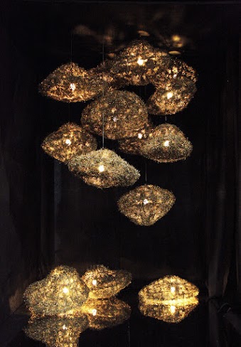
The most interesting and jaw-dropping fixtures were made from novel materials assembled in unusual and artistic ways.  Twenty-three year-old Jim Torres, an industrial designer from the Philippines, debuted an interesting pendant for Zarate Manila made from metal shavings.  Cloud-like in form, the Escapade fixtures seemed to float in air.  Lamped with typical incandescent light bulbs, the fixtures would be extraordinary if lamped with more efficient and concentrated lighting elements.


Venzon Lighting's Cherry Blossom Linear Pendant was also cloud-like in structure.  Blossoms made of shell are adhered to a painted aluminum frame.


Venzon's Sea Grass Collection had a decidedly organic feel.  The wall sconce cast interesting shadows from its reticulated shade.


Cast shadows were a prominent feature of the Beacon pendant introduced by Allied Maker.  Cylindrical in form, the fixture is inspired by the work of George Nakashima, renown architect, master woodworker and father of American craft.  Casting light up and down, the vertical pendants and sconces come in a variety of lengths and are especially dramatic when grouped.  All of Allied Maker's fixtures are made in the company's Long Island, New York workshop and are hand-finished.


Light and shadow, illumination and reflectance--these qualities are the essence of the sculptural Lure Sconce exhibited by Pelle Designs.  Hand-sculpted petals made of cast paper are illuminated by an LED spotlight suspended from a brass arc.  The spotlight reveals the intricate layers of the blossom while the white petals reflect and illuminate the surroundings.


Form, pattern, texture and illuminance categorize the multiple offerings from Axo Light.  Simple linear and geometric shapes are evident in their U-Light, Framework and Hoops fixtures.  The U-Light, introduced at ICFF, is an aluminum U-shaped frame with an attached ring embedded with an LED strip.  Its form is at once simple, yet monumental.


Axo Light's Framework is a collection of wall, ceiling and pendant fixtures in the shape of a simple rectangle.  Layering the fixtures at different heights and angles creates an abstract assemblage.


Axo Light's Hoops fixture packs a concentrated LED up and downlight in a sculptural pendant finished in 24 karat gold.  Its lines are sinuous and elegant, yet equally contemporary.


Adjacent to Hoops, above, is Axo Light's Mountain View fixture, made of hand-blown glass, revealing the texture and silhouette of rugged mountain peaks. 

Pattern adorned the shade of Axo Light's Melting Pot pendant and wall fixtures.  The shades are available in light patterns with white inside or dark patterns with gold inside.  The asymmetric juxtaposition of pattern and form are a surprise element.


I always like to see the work of Michael McHale Designs at ICFF.  Like me, Michael left a law career to do something more creative.  His lighting fixtures combine the elegant and the mundane: for example, a skeletal structure of industrial pipes dripping with faceted crystals.  His Matrix collection uses a universal base, allowing buyers to swap out the design elements as their tastes or fancies change.


Sunday
May222016

Take A Seat

In addition to practicing design, I teach it.  Teaching rewards me as well as (hopefully) my students: it enables me to impart an appreciation for design to my students while reinforcing the depth of my knowledge and experience.  That's why it was such a treat to see the winner and runners-up of Wilsonart's Challenges Student Chair Design Competition with the #Designhounds at the International Contemporary Furniture Fair (ICFF) a week ago in New York City.

This is the 12th year that Wilsonart, a leader in engineered surfaces, notably laminate, has sponsored this competition.  The competition challenges students and budding furniture designers to create a unique chair using Wilsonart laminate.  Each year the students' creations are inspired by a different theme, this year's theme being "design for delight."  Wilsonart hosts the competition at a different American design school every year.  The College for Creative Studies in Detroit, Michigan -- a private, fully accredited college with a student body of 1,400 students, granting bachelor and masters degrees in the Arts -- was chosen this year.

While "design for delight" might have been the theme of the chairs -- resulting in designs that ranged from whimsical to avant garde -- the engineering feat undertaken by the students to create a functional seat with a somewhat immalleable material was inspiring.  I couldn't help but thinking that it was only 70 years ago that Charles and Ray Eames figured out a way to bend plywood with their LCW chair, an invention that paved the way for the students' creations.

Whimsy was clearly at the heart of runner-up Alejandra Bucco's Pie Chair.  The checkerboard pattern with apple silhouettes was created with laminate!


Runner-up Adam Whittaker's En Throne chair was also an amusing take on the iconic royal seat.


Veering toward the avant garde was the chair created by contest winner, Stephen Marchio.  His Prelude chair enchanted the judges through its use of pastel colors and slanting angles.  Explained Design Historian and Wilsonart Challenges Program Director Grace Jeffers, “The slanting angles of this chair are an optical illusion, which distract us from the fact that the lines of this form are perfect right angles."


I also loved the experimentation with form in the Geode Chair by the second runner-up, Zachary Boomer.  The chair beckoned me to "take a seat."  What the chair lacked in comfort, it made up in imagination.


Contest winner Stephen Marchio set this intention for his winning chair: to reflect “the idea that a maker often looks back on his or her work from years ago and can get the sense of progression.  It projects into the future of a skilled designer’s life while simultaneously honoring all the little steps they took to get there.” . . .  kinda the same experience I get from teaching.  I hope that the students can look back at the experience afforded them by Wilsonart as the springboard for long and successful design careers.  Congratulations finalists.


Disclaimer:  Wilsonart was a co-sponsor of my trip with the Designhounds to the ICFF.  Chair pictures courtesy of Wilsonart.

Tuesday
May172016

Potty Talk

Saturday morning, May 14th.  I was on the road by 8:00 am.  I whizzed down the Mass Pike; I-84 and I-91 in Connecticut; the Merritt, Hutchinson River and Henry Hudson Parkways and arrived at Eighth Avenue and West 14th Street, near my daughter's apartment in New York City by 11:30 am.  Two hundred miles in three and a half hours.  I was on a roll.  I figured I'd drive around the block once to see if I could find parking on the street.  I prayed to the NYC parking gods and they answered my prayer.  Just as I turned onto West 16th Street, a car pulled out of a great spot (and I mean GREAT) -- good until Monday morning.  A great way to start the weekend!

So began my trek to New York City for the International Contemporary Furniture Fair (ICFF) with the #Designhounds, a community of design-loving bloggers and interior designers sharing the best of design, fashion, food and travel.  In its 29th year, the ICFF is a multinational tableau of vendors, artisans and craftspeople offering innovative furnishings for the residential and commercial design marketplace.  We roamed all two and a half floors of the ICFF at the Jacob Javitz Convention Center perusing more than 750 exhibitor booths, but also shared some private talks with Luxe Interiors+Design, TOTO USA, Wilsonart and Ittala.  In this post, I want to share some interesting and, dare I say, intimate facts about toilets, courtesy of TOTO USA.  [Disclaimer: TOTO was a sponsor of my Designhounds venture].

As a LEED-certified designer (LEED stands for Leadership in Energy and Environmental Design), I emphasize conservation and sustainability in my designs.  Did you know that 27% of the water used in one year by an average American family of four is from toilet flushing?  And that's more than any other household use of water.  TOTO is a pioneer in developing water efficient products starting with their toilets.  The company was the first to bring 1.6 gallons per flush (GPF) toilets to the American market, was approached by the U.S. Environmental Protection Agency (EPA) to develop a 1.28 GPF toilet, and now has 1.0 GPF toilets in its product line which save 35% more water than standard 1.6 GPF toilets.

TOTO set the benchmark for high-efficiency toilets.  If you want the gold standard, consider the Neorest 750H.  This toilet senses when it will be used and pre-mists the bowl which better prevents waste from adhering to the bowl's surface.  To enhance the non-stick surface properties, TOTO engineers developed a titanium dioxide and zirconium coating fired into the bowl's interior glaze which furthers the elimination of organic substances including lime scale and mold.  Topping it off, an ultraviolet light is activated when the lid closes causing a photocatalytic reaction that destroys any remaining organic material inside the bowl. 


The interior glaze of the Neorest 750H has a pearlescent quality.

The technological advancements in Neorest are featured in other TOTO toilets.  As with Neorest, these toilets feature a hole-free rim and TOTO's patented Tornado flush technology which uses two nozzles to release water powerfully into the bowl, circulating the surface area, maintaining a waste-free and germ-free environment.

If TOTO had its way, it would be converting Americans to its Washlet.  The Washlet is a toilet seat with bidet functionality.  To date, TOTO has sold 40 million Washlets world-wide.  But Americans are slow to embrace its virtues.  I had a client about 10 years ago who traveled to Japan on business and while there, experienced the Washlet.  As soon as he returned home, he purchased a Washlet for his master bathroom.  It's just that good.  With a slow-close lid, the Washlet features a pre-mist and post-mist of electrolyzed water to keep the bowl clean and cling-free, a sensor-controlled heated seat, a nozzle that dispenses a cleansing warm-water spray and a warm-air dryer.  And all can be remote-controlled in the palm of your hand.


Thanks to TOTO, I'll be trying the Washlet out.  But I dare say I'll write a follow up with a play-by-play of the experience.

Page 1 ... 2 3 4 5 6 ... 38 Next 5 Entries »